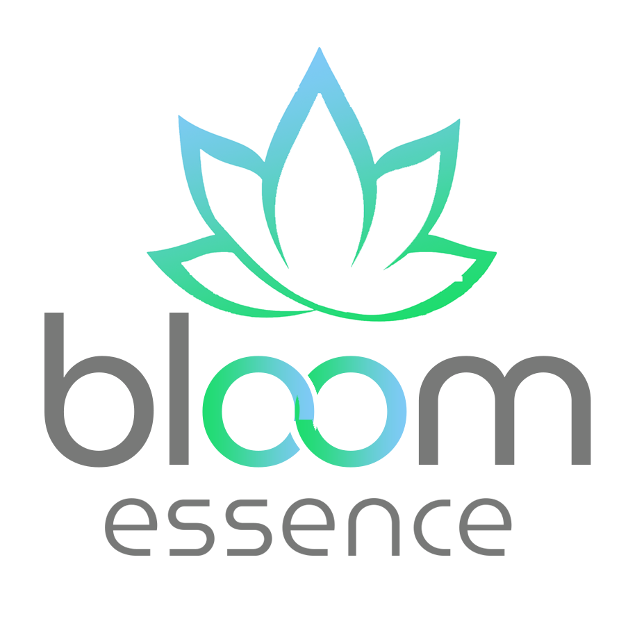
Bloom Essence Logo Instructions
Changes needed:
- The colors should be a gradient between green and teal.
- The font used was MuseoModerno and on the word “bloom” it works perfect. On the word essence I don’t like it that much and would prefer a font that’s similar but curves the ending of the “s”, “e” and “c” more.
- I joined the two “o” to give it more character. I took the idea from the third logo attached. I don’t know if we can get in trouble for copying it so closely or if there are some more variations to give it a bit more of originality.
- The icon was borrowed from istock photo but we need an original icon following the same concept of a type of plant blooming. Even though we’re focusing on CBD products I don’t want leafs that identify the icon with a marijuana leaf, I rather have something more generic.
- As far as size and proportion of lettering, font color and icon are concerned I like it just like on the draft.


Color Palette

Logo Inspiration


